Design
Designer — Ritesh Mandaliya
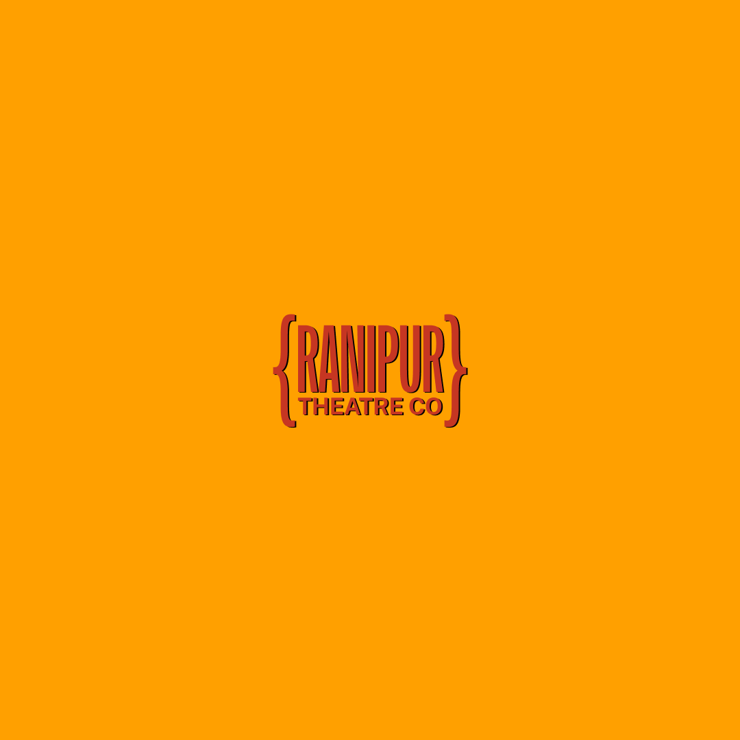
Ranipur Theatre Co. — Logo Design Summary
The identity blends classic Bollywood inspiration with a modern, refined aesthetic. The hero wordmark uses New Title(Indian Type Foundry), chosen for its tall, expressive letterforms that echo vintage hand-painted Bollywood posters while remaining clean and contemporary. “THEATRE CO” is set in a neutral sans-serif to provide clarity and balance.
The colour palette draws from aged Bollywood poster tones—deep maroons, warm yellows, and slightly desaturated hues—to create a warm, cinematic, and sophisticated feel. Alternate colourways (orange/red, green/tan, blue/red) give the brand flexibility.
Curly brackets { } act as the signature motif, framing the wordmark to symbolise an enclosed theatrical space. They add subtle flair and form a distinctive graphic device that extends across posters, patterns, and broader brand applications.
Overall, the identity is nostalgic yet modern, expressive yet restrained—perfectly capturing the theatrical, cultural, and contemporary spirit of Ranipur Theatre Co.